Thursday, December 16, 2010

Snow and Stalkers


Considering the wintery abyss that has become our new home in the last few days, I found it imperative that I at least reference snow in my weekly blog. So, as I browsed through websites of my sister’s Ringling friends, I was lucky enough to stumble upon the image above. In this drawing, Brooke Olivares, has depicted a snow-covered alley with tints of warm colors to brighten up the scene. In the upper right hand corner, the rustic orange color of a building seems to draw out the warm hues dispersed throughout, as the snow melts away at its touch. Instead of the typical foreboding alley, Brooke has turned this image into an almost welcoming abode. Although the stairs lead to the ajar doors at the top, the viewer, as they would in any shady situation, follows the 'light at the end of the tunnel.' One cant help but wonder what they might find if they walk beneath the shadows to the sparkling snow in the distance.

In addition to this winter wonderland scene, Brooke’s website contains many other quick drawings. My favorites were those of people caught in everyday actions, such as snoozing in the airplane, eating a leisurely lunch, or zoning out in math class. Although each piece isn’t perfectly proportioned or completely colored in, the viewer gets just enough to know what she is trying to depict. My personal favorite is a pen drawing of a student slouching in his chair. He is obviously trying to be focused but at the same time battling a sleep deficit. Because of the more intense shading used to depict him, the viewer gets the illusion of a photo in which the up close shot is in focus while the rest is blurry. As I browsed through her drawings I began to realize that art is somewhat of a stalker hobby – I bet most of people in her sketches are still unaware that she ever drew them. So word of the wise for those traveling this holiday season: beware of the figure scribbling away in the corner because you may just be the target of a sketch that a high school student uses on her blog.


Friday, December 10, 2010

'Wild Things' in our midst


As a tyke, according to my parents, I was what one could call as a wild thing. They like to tell the story of the time I almost strangled the minister in the middle of children’s story time…. Yes it sounds bad, but in my defense, I was just giving her a tight hug from behind. It wasn’t until the young age of six that I had my first encounter with a wild thing like myself. It went a little something like this:

“That very night in Max’s room a forest grew and grew…And when he came to the place where the wild things are they roared their terrible roars and gnashed their terrible teeth and rolled their terrible eyes and showed their terrible claws till Max said be still and tamed them with a magic trick.”

Not surprisingly, this became one of my favorite books along with the Big Hungry Bear and the classic Green Eggs and Ham. Not only did the plot of the story draw my attention, the pictures of the many wild things fascinated me. There were talons, scales, feathers, beaks, snouts, and horns galore. All portrayed in bright colors; sure to catch any curious 6-year-old’s eye.

The artist and author, Maurice Sendak, uses pen and ink for most of his illustrations along with other mixed media to show color. Extensive crosshatching can be seen in all of his drawings, used to convey shadows. In the story, as Max’s room transforms into a jungle, the amount of pen and ink decreases and a less stark media takes over. The background scenes in the jungle are all fairly muted and have a somewhat blurry feeling, which I assume is an allusion to Max’s dream. Yet, like Max, all the wild things are portrayed using pen and ink. Just as I did, the viewer easily overlooks this artistic transition at first glance. But as I continued to scan the book I noticed much more detail than I ever had before. In my young wild state, I didn’t fully appreciate the talent of Sendak, but now as a somewhat tamer individual I see what a great artist he is.

Thursday, December 2, 2010

Morals from the Wizarding World

Yes, I have to admit; I was one of the crazy Harry Potter fans that flocked to the midnight premier. Although non-fans would beg to differ, seeing HP on the big screen at midnight was definitely worth my time. Not only did I feel a sense of overwhelming excitement for the next movie, but also my love for the wizarding world was rekindled. This particular movie was different from all the rest in that they used graphic animation for an entire scene. Hermione reads the story of the three brothers, as black and white graphic images flit across the scene. I loved this part and I think it added a lot more to the movie than if she had simply read aloud. The story is about 3 brothers who come to an impassable river and create a bridge, angering death so much that he stops them in their path. Cunning as he is, death gives them each one request. The first brother asks for a wand that can never be defeated. The second brother asks for the power to bring back loved ones from the dead. And lastly, the third and wisest brother asks for a way to be invisible to death until it his time to leave the earth. Unsurprisingly, the first two brothers do not live long, for their wishes turn against them and death gladly takes them for his own. But, the third brother lives a long life until he gives his invisibility cloak to his son, greeting death as an old friend. This fictional story is meant to teach kids the morals of humility, wisdom…etc. But also, it unveils universal messages; one cannot cheat or ignore death for it is inevitable.

Long before the time of Harry Potter, the sagacious lessons taught in the tale of the three brothers were present. On the wall of the Camposanto, the enclosed burial ground next to Pisa’s Cathedral, is a fresco called The Triumph of Death. On the left, young aristocrats, in lavish attire, stumble upon three corpses decomposing in their coffins. The men hold their noses and the women turn away in horror, as they stand amidst the atrocity of death. In the far left upper corner, Saint Macarius unfurls a scroll, which discusses the inevitability of death. In comparison, the figures in the far right scene seem to foolishly ignore death. As they amuse themselves, angels and demons compete for the souls of the corpses piled in the foreground. The wealthy persons carousing in luxury are unprepared for death, and therefore are unlikely to achieve salvation; imagery meant as a warning against greed and lust.

Although some die-hard fans derive their moral lessons from Harry potter, I am proud to say that I have learned equally as much from a 14th century Italian fresco.

Monday, November 29, 2010

The Evening Post


Now that we’ve all filled ourselves to the brim with turkey, sweet potatoes, and pie galore, we all know it ‘tis the season to be jolly. Along with the many Christmas songs and festive activities, I’m always reminded of a certain artist in the holiday cheer. For as long as I can remember, Norman Rockwell has been one of my favorite artists. Whenever I think of his work, an image of a jolly Santa pops into my head. I suppose this is due to the pieces of his that I saw as a kid. I now know that he his painting repertoire expands much farther than old Saint Nick, but I still like to consider Norman Rockwell my ‘Christmas artist.’
Best known for his 322 Saturday Evening Post cover illustrations, Rockwell became a 20th century American icon. He painted everything from Santa Clause to racial segregation. His realistic style is easy for the viewer to connect to. For instance, in the painting at the right, a day-in-the-life scene is depicted. The young girl sits upright on her stool, proudly showing off her flowers to the waiter across the counter. The anxious hours before for this night seem to have paid off; her date, sits, turned completely towards her, and smiles proudly. The viewer can sympathize with the youthful excitement hanging over the scene. Even the man on the other side of the girl grins as if remembering those youthful years of his own.
In my search to find something to write about for this week’s blog post, I looked through student artwork from the Ringling School of Art and Design. My inspiration came from Francis Vallejo’s The Sagging Evening Post. I was blown away by the creativity displayed in this work. Two ever so different men stand side by side. One, a member of the i-think-im-so-cool-because-my-pants-are-about-to-fall-off clan, and the other can’t seem to pull up his pants enough. Yet, both look at each other in distain, for they are certain that their pant-wearing ways are the best. It’s up to the viewer to make the laborious decision of: “to sag or not to sag?” Whatever the verdict, I think all would agree on the immense talent displayed in this piece of work. Similar to Rockwell, Francis Vallejo portrays the figures in a realistic, yet somewhat exaggerated style. Their brushstrokes are smooth and connected and the shading and hues used are accurate. Most important, both artists draw the viewer into their work by displaying scenes that one can connect too.

Thursday, November 18, 2010

The Importance of Watermelon


Last year for Christmas, my cousins sent me a unique t-shirt. On the back was a picture of a melon, with the words, “Eat Mo’ Melon” above. Considering that my uncle grows watermelons for part of his job, this seemed to be an appropriate slogan for his triathlon team shirts. So now, the Miller family can walk around and encourage people to eat watermelon in the same way chick-fil-a attempts to sell chicken…quite amusing. Anyways, the point I’m trying to show is that melon is obviously very important in my family. Every year when we all meet at the beach, some type of melon is served with just about every meal. Because of all of this extra rind lying around, a few years ago, my cousin Jesse began to carve the leftover watermelon shells. The first year he started out simple and made a face with a carved flower for the “hair.” Last year he stepped it up a few notches, proceeding to create a fierce watermelon shark. The mouth, with many large teeth, was opened wide with a human foot made out of rind in its mouth… truly terrifying. Next, he added grape eyes and a rind fin. We all viewed it as a masterpiece, to say the least.

Amazing works of art can be created from foods other than watermelon I soon learned, such as eggs made into baby carriages, cauliflower sheep, and sushi nintendos. I was surprised to discover that people actually devote their time to crafting food into art on a daily basis. My favorite ‘piece of artwork’ that I found was an orange rind created into a man that was carrying an orange to the blender. The orange seems to weigh heavy on his shoulders as he takes a step forward. Although the artist is unknown, I have to give him/her major creativity points. I only wish I could be as cool as the food genius who created the orange man…maybe in a second life.

Wednesday, November 10, 2010

Mozart in Paris

Saint-Chapelle
Paris, France


When I was in 7th grade, my family went to Paris for spring break. The trip there ended up being much more stressful than any of us had imagined. It all started when we were informed that our first flight would not be taking off. Panic stricken, we searched for any mode of transportation to get us to Philadelphia in order to make the flight to France. After endlessly searching it seemed as though the reality of our Paris excursion was coming to a close. But finally, with the help of some southwest workers, we managed to get on a flight to Baltimore, at the expense of some other travelers. Thankfully, I don’t think they ever knew, hopefully we wont have to deal with karma later in life. The rest of the day was one of the most hectic and stressful days in my life. After renting a car in Baltimore we raced to Philadelphia in the middle of a massive snowstorm, as cars swerved off the road left and right. I remember sitting in the backseat of the cramped car in a dream-like state, attempting to divert my eyes from the crazy scene outside our warm car. At long last, we reached the deserted Philadelphia airport, jumped out of the car and ran inside to the AirFrance desk. Believing that we didn’t have enough time to take the rental car back, my dad simply parked the car in the airport lot and hurried inside to meet my mom and me. Thankfully security was a breeze considering we were the only people in the terminal because all other flights had been canceled for the night. We ran with our bags swinging and scarves flying until we reached our gate, only to find out that the flight had been delayed another hour. We took a satisfied but somewhat defeated breath and sat down, becoming known to those around us as ‘the crazy running Americans’.

Yet, I would go through that hectic day again if I could go back to France. Walking next to the Seine eating a homemade crêpe, listening to live music in the streets, viewing beautiful architecture, it doesn’t get much better than that. One of my favorite, yet coldest experiences was when we visited Sainte-Chapelle. The alluring building is known for its incredible stained glass windows. From the outside one can’t appreciate the multitude of colors, but the interior is astonishing. I remember walking inside and looking around in awe as the light shone through the windows. The wall-dissolving style of Sainte-Chapelle exemplifies High Gothic architecture in France. An astonishing 6,450 square feet of glass make up the high windows all around the building, the largest designed during their time.

Enticed by the concert flyers tacked up in the front of the building, my family and I decided to go to the Mozart concert that night in Sainte-Chapelle. Not surprisingly, the building did not have a heating system… none of us were fully prepared for this considering we had never been to a concert in an ancient stone building lacking the seemingly simple technology of a heating system. Needless to say it was a very cold surprise. Saint-Chapelle at night was a different church altogether from the shining, colorful building I had seen earlier that day. It was a perfect setting for a horror film: ominous shadows bouncing off the dark walls, the notes of Mozart wafting throughout the interior, as a group of innocent American tourists sat shivering in the cold. Still, we couldn’t have listened to a French string quartet in a more desirable setting.

Thursday, November 4, 2010

Let the good times Roll..


The other day in class we created our own tympanums. My partner, Gracie, and I brainstormed many ideas: jungle, United States, anti-religion, apple computers…etc. But finally we decided to depict a rock band. We first divided our arch into three registers: crowd, stage, and backstage. In the center of our tympanum we drew a singer with spiked hair, skinny jeans, and chains. Around him is an almond-like shape, similar to a mandorla that would have surrounded Christ in the Romanesque period. He is depicted as the leader of the band, with his co-rockers on either side of him. The drummer and guitarist sit on his right, while the shaggy pianist plays away on his left. In the lower right hand corner above the lintel are speakers, sending the music towards the audience. Screaming silhouetted figures crowd the bottom register above the lintel. At either end of the audience, buff body guards stand watch to protect the rock band above.
Similar to the tympanum of the center portal of the narthex of La Madeleine, our voussoirs have images inside of them. Yet, while La Madeleine has images depicting people of different cultures from around the world, we drew images meant to symbolize different rock bands. From right to left, the bands depicted are: ACDC, the beatles, guns n’ roses, the rolling stones, the eagles, the police, red hot chili peppers, and earth wind and fire. Each voussoir, separated by bands of design, has a stage light protruding from the bottom shining towards the central figure. This is similar to the South Portal of St. Pierre, where all figures face Christ. Throughout the entire background of our tympanum, interlacing designs swarm, disguising various musical signs. Patterns such as this bring back the interlacing style of the warrior lords from the medieval period. Except in the case of our tympanum, music notes take the spot of animal figures amongst the interlacing designs. The central image above the lintel is a Latin phrase, translating as ‘let the good times roll:’ a summation of our tympanum.

Thursday, October 28, 2010

Beowulf brought to life

“They laid their dear lord, the giver of rings, deep within the ship by the mast in majesty; many treasures and adornments from far and wide were gathered there. I have never heard of a ship equipped more handsomely with weapons and war-gear, swords and corselets; on his breast lay countless treasures that were to travel far with him into the waves’ domain.” – Beowulf

Early medieval kings were revered to the upmost standard. Not only were they buried underground in a ship, but they were surrounded with treasures galore. In 1939, archaeologists discovered a treasure-laden ship in Sutton Hoo, off the coast of Suffolk, England. Among the many precious artifacts found were 40 gold coins, a gold purse cover, 10 silver bowls, a silver plate with the imperial stamp of the Byzantine Emperor Anastasius I, a gold belt buckle, and 2 inscribed silver spoons. This momentous discovery led to insight about the intriguing culture of the Anglo-Saxon people. Yet the mystery remains, who was the king of this glorious tomb?

Known for their speed and grace, the Viking ships carried the warriors from Ireland to Russia, to Iceland, to Greenland, and on. Yet in the early 10th century, the Vikings finally settled in northern France; a territory that came to be known as Norway. It was here in the city of Oseberg that another impressive ship was discovered. Adorning the exterior were striking examples of Viking wood carving, such as the animal-head posts. These powerfully expressive heads combined the interlacing patterns and animal forms of warrior lord art from the northern frontiers of the former Roman Empire.

Both richly furnished burial ships stand out in history amongst the many other ‘more normal’ tombs, giving the art historian insight into the cultures of the past.


Tuesday, September 28, 2010

Puffy Muffin - A mix of food and art


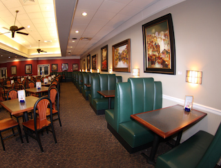
A couple of weeks ago, when my mom was out of town, my dad and I decided to go out for a Saturday brunch. We brainstormed about places to go and finally concluded that the Puffy Muffin was the choice of the day. So we scurried on over to the Brentwood hill center and grabbed a table. I generally go to the Puffy Muffin once a year with a mother-daughter book club, so it had been a while since I had entered the bakery. I looked around, and for the first time I noticed all the watercolors hanging on the walls. In fact there was one over the green booth we sat in. It wasn’t my favorite piece of artwork I’d ever seen, but it was interesting because the artist gave his/her paintings an almost transparent look by portraying reflected light. After returning home, I remembered my curiosity and googled ‘puffy muffin artists.’ I found her, Gail McDaniel; a local watercolor artist whose work in displayed in multiple places around the world. On her website, I found a whole collection of her work; all very similar to those that I saw at brunch. To the right is a painting of hers that I pulled from her website. I like the looks of this one more than the others because the shadows on the ground are intriguing and the bright hues give the painting a surreal feeling. I was surprised to find that McDaniel seems to paint every subject imaginable; everything from horses to teacups. In addition, some of her other works were composed of bold, not transparent, colors. This mix of styles shows that McDaniel is a very versatile artist, capable of surreal as well as realistic works (see painting to the left).

I still can’t believe it took me so long to notice the art at Puffy Muffin. Next time I venture there, I will be sure to look around carefully. Perhaps a new local artist will be showcased.

Friday, September 17, 2010

Opposites Abstract


January 2, 2007 by Clare Coyle Taylor

Stop versus go. On versus off. Emptiness versus full. Light versus dark. The old saying, 'opposites attract,' is a common theme in Clare Coyle Taylor's colored pencil drawing. Two darkly hued square-like shapes take up the center of the work. Yet, the central hues are different; you could even say opposites. The top square seems to be like an bottomless pit; leading into an dark abyss. If one were to walk up to it, they might just fall in. In comparison, the bottom square has an almost threadlike quality, the black lines become less condensed towards the outside of the square. The center is a reverberating red, like a switch that's been left on but is about to go out. The dispersed black lines give it that flickering quality. Perhaps, the above square is meant to depict the light of the lower square after it has conked out. Around the opposing squares, are a multitude of colors - pink, green, blue, orange, yellow; essentially a rainbow. These bright hues bring out the contrast of the dark centerpieces. The pink in particular surrounds the 2 figures in an almost neon glow; possibly representing an outer world. The 'hustle and bustle' of hues around the squares gives the sketch a rushed appearance, yet the dark figures of solitude in the center remain; with the hype of the outside just barely lingering within the lower one.

Wednesday, September 8, 2010

Tranquility


Le Soleil Levant

By Claude Monet

A noiseless scene is displayed in Claude Monet’s Soleil Levant. The calming hues establish a peaceful mood, as the sun shines through the monotonous grey tones of the indiscrete trees. The viewer’s eye is first drawn to the darkest figure in the boat, where it lingers before being sucked into the adjacent rare orange lines in the water. The thick blazing brush strokes lead the eye back to the rising sun; the one distinct circular figure in the painting. The sky above the sun is a dull yellow with sparse strokes of pink, green, grey, and blue. Yet a line is created as the hues shift to darker tones of blue and grey around the sun. Although the trees are not realistically depicted, the idea is transcribed to the viewer in a minimal way. Thick green horizontal brushstrokes in the water enunciate the reflections of the trees and underbrush. A gentle grey wash sets an overcast glow over the scene as if to represent the fog or mist of the early morning. It seeps in from both sides of the painting, in attempt to consume the sun.

Two boats, both carrying passengers, float alongside each other. Yet, the more central boat is a darker hue, making it stand out drastically against the soporific water. The solitary figures seem to be drifting in the seclusion of the tranquil morning. The river sweeps back around and is hidden to the eyes of the viewer, but it leads somewhere far away as if the river itself is leading to a more peaceful place. Drifting along with the tide, swaying in the current of hues, the viewer is sent off into the distant unknown peace just around the sun.

Tuesday, August 24, 2010

Meloncholy

Meloncholy and Mystery of a Street
by Giorgio de Chirico

Shadows envelope the scene, as the silhouette of a little girl runs across an open street. Although it is unclear where she may be heading, her prancing figure seems joyful. Her hair and dress flip behind her as she cavorts, hand in hand with a hoop. A monumental dark building looms in front of her. Its structure is almost jail like, with its cement looking texture. The arches become progressively smaller but stay the same endless black. The dark shadow cast from the building creates a strong line cutting across in front of the girl. Enveloped in the shadow is a vacant wheeled trailer with its doors swung open. Its lightly hued doors and left flank stand out against the dark shadows. Adjacent, is the street, which is of a very similar hue to that of the illumined trailer. It stretches back past the shady building making it seem as though the light is overtaking the dark rather than the dark enclosing on the light. Across from the sinister edifice, another arched building stands, stretching as far back as the eye can see. This structure is a piercing white, yet has the same dark tones beneath the consecutively smaller arches. It seems more habitable than the latter building, with its bright tones and waving red flag.
The ominous shadow of a figure is cast in the center coming towards the little girl. Who is this person? Could it be the owner of the trailer, the father of the little girl, a kidnapper? One cannot know for certain, but the idea of an unknown figure makes the scene foreboding. The contrast from light to dark seems to be a common theme in the painting. Whether this hints to an underlying message or is simply a way to demonstrate contrast, it leaves the viewer pondering about the melancholy and mystery of a street.