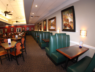
A couple of weeks ago, when my mom was out of town, my dad and I decided to go out for a Saturday brunch. We brainstormed about places to go and finally concluded that the Puffy Muffin was the choice of the day. So we scurried on over to the Brentwood hill center and grabbed a table. I generally go to the Puffy Muffin once a year with a mother-daughter book club, so it had been a while since I had entered the bakery. I looked around, and for the first time I noticed all the watercolors hanging on the walls. In fact there was one over the green booth we sat in. It wasn’t my favorite piece of artwork I’d ever seen, but it was interesting because the artist gave his/her paintings an almost transparent look  by portraying reflected light. After returning home, I remembered my curiosity and googled ‘puffy muffin artists.’ I found her, Gail McDaniel; a local watercolor artist whose work in displayed in multiple places around the world. On her website, I found a whole collection of her work; all very similar to those that I saw at brunch. To the right is a painting of hers that I pulled from her website. I like the looks of this one more than the others because the shadows on the ground are intriguing and the bright hues give the painting a surreal feeling. I was surprised to find that McDaniel seems to paint every subject imaginable; everything from horses to teacups. In addition, some of her other works were composed of bold, not transparent, colors. This mix of styles shows that McDaniel is a very versatile artist, capable of surreal as well as realistic works (see painting to the left).
I still can’t belie ve it took me so long to notice the art at Puffy Muffin. Next time I venture there, I will be sure to look around carefully. Perhaps a new local artist will be showcased.


